
Melanie Castro
Graphic designer of 5 years that specializes in layout design, social media content creation, and packaging design, with a strong foundation in visual communication. Always excited to learn new skills and experience new challenges.

The Hand in Hand App Redesign
Ashley Lee Cosmetics Cuticle Oil
LQQKS Classic Handle Barber Shears
Ashley Lee Cosmetics H! Sh!ne Nail Polish Logo

Ashley Lee Cosmetics' Color Hair Wax Facebook BETA Ad

Ashley Lee Cosmetics Clutch Eyeshadow Palette Image

Ashley Lee Cosmetics Frosted Shimmer Lip Gloss Image

FAU METROLAB Windows


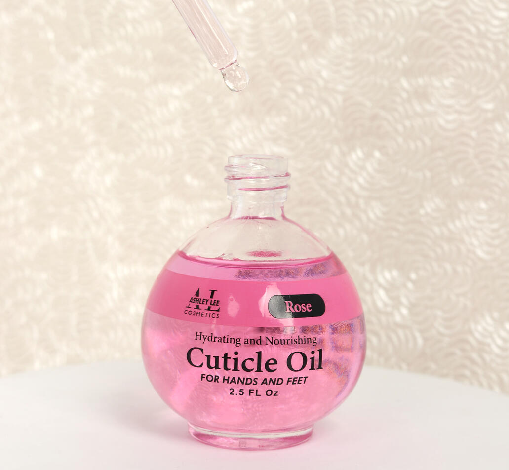
ASHLEY LEE COSMETICS CUTICLE OIL
2025CLIENT: ASHLEY LEE COSMETICSAshley Lee Cosmetics’ Hydrating and Nourishing Cuticle Oil for Hands and Feet was thoughtfully developed with spa owners and professionals in mind, offering an ideal solution for bulk purchasing. The product’s minimalist design draws inspiration from the serene and uncluttered atmosphere of spas, encapsulating a sense of tranquility and refinement. A key feature of the design is the harmonious integration of scent and color, with a band encircling the bottle that precisely matches the fragrance that's correlated to each bottle. Thus, creating a design that is both visually cohesive and sensorially appealing.


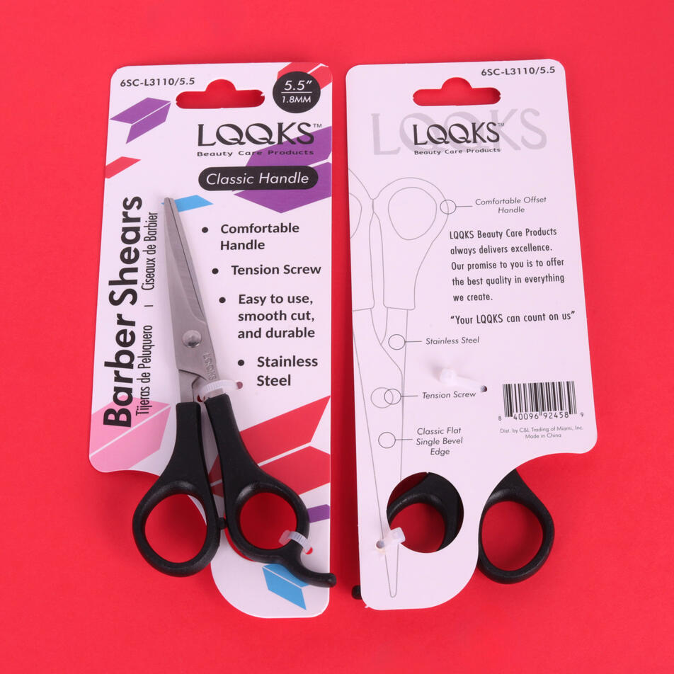
LQQKS CLASSIC HANDLE BARBER SHEARS
2024CLIENT: LQQKS BEAUTY CARE PRODUCTSThe LQQKS Classic Handle Barber Shears is an accessible and high-quality line within the LQQKS brand, designed to deliver professional performance at an affordable price. The packaging features dynamic, paper airplane-inspired shapes that symbolize the precision and smooth finish of each cut. Bright colors and repeated geometric forms, set against a clean white background, align seamlessly with LQQKS’ vibrant and playful brand identity. To the right of the shears, clearly presented bullet points highlight the product’s effectiveness, while the reverse side includes a diagram corresponding to the specific shear model showcased on the front. Functionality is at the forefront of the design, with dual openings at the bottom of the card that allow customers to insert their fingers into the shear handles. This function offers a tactile experience of the tool’s movement without unsealing the packaging.


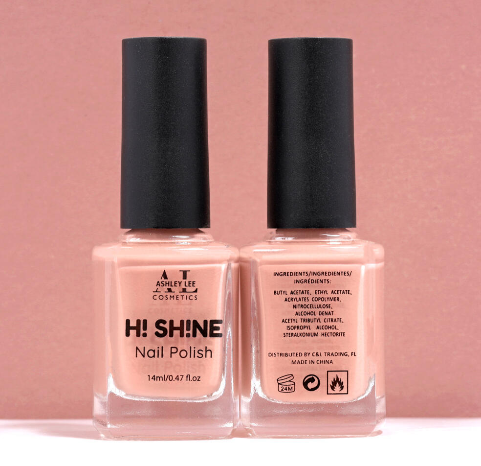
ASHLEY LEE COSMETICS H! SH!NE NAIL POLISH
2023CLIENT: ASHLEY LEE COSMETICSH! Sh!ne is a vibrant and playful nail polish line from Ashley Lee Cosmetics, created to embody a sense of fun, trendiness, and individuality. H! Sh!ne's distinctive identity is reflected in its bold, rounded logo, where the substitution of the letter “i” with an exclamation mark not only adds a visual twist but also cleverly mirrors the letter itself. The inverted “i” reinforces the product’s uniqueness. The name H! Sh!ne evokes the bright, glossy finish of the polish, capturing the spirit of joy and self-expression, much like a cheerful greeting at the start of a radiant day. Each shade in the collection is designed to stand out, making a bold yet approachable statement.


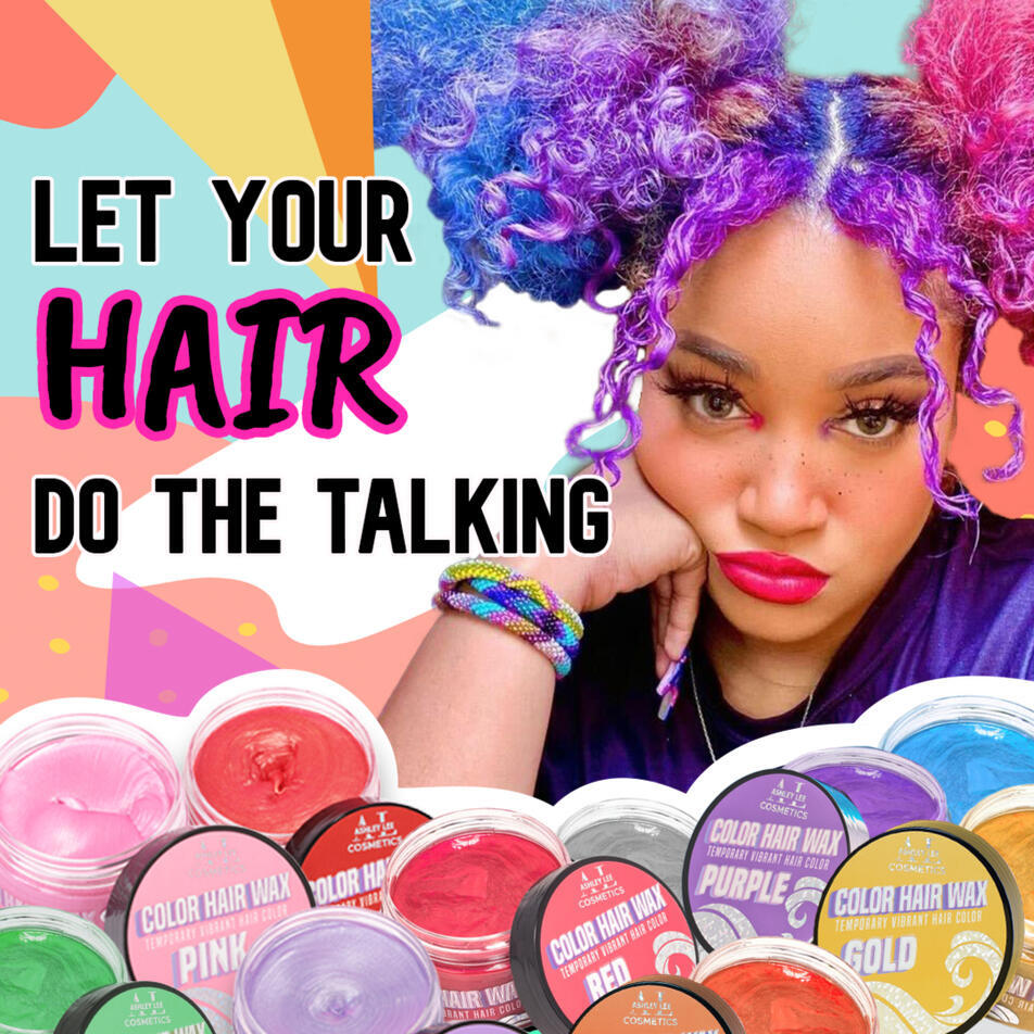
Ashley Lee Cosmetics' Color Hair Wax Facebook BETA Ad
2023CLIENT: ASHLEY LEE COSMETICSUsed as BETA testing for a Facebook campaign on Ashley Lee Cosmetics' Facebook page, the goal of this image is to promote Ashley Lee Cosmetics' Color Hair Wax line. The goal was to drive traffic to the Ashley Lee Cosmetics website to curate a larger audience and an increase in the sales of the items. On the right, there's an image of an influencer using the color hair wax on her hair; which shows the quality of the product. Alongside her are different colors of the color hair wax that Ashley Lee Cosmetics have in stock. The quote "let your hair do the talking" means hair is one of the biggest way one can express themselves from styling to even coloring their hair. With all this in an image, it creates a statement of free expression with the usage of fun bold colors.

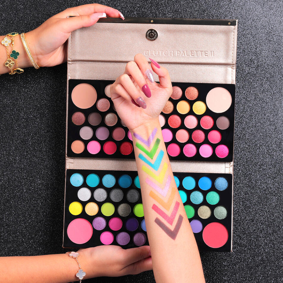
Ashley Lee Cosmetics Clutch Eyeshadow Palette Image
2022CLIENT: ASHLEY LEE COSMETICSThis image was used for social media outlets such as Facebook and Instagram to promote the Ashley Lee Cosmetics Clutch Eyeshadow Palette. The target audience is women within the 20s-40s bracket. The image highlights an eye shadow palette that carries colors for both the "glam look" and the "no makeup" makeup look. To make the audience fascinated in this product, the eyeshadow palette is wide open to expose all 88 vibrant colors that come in a matte or shimmery texture. On the front of the clutch palette is an arm with 8 colors on it. It not only shows the variety of colors on skin but it shows the quality and high pigmentation that the audience can expect. Because of how simple it is with its black glittery background, this image can be used for several occasions such as Halloween, Black Friday, Christmas, and more.

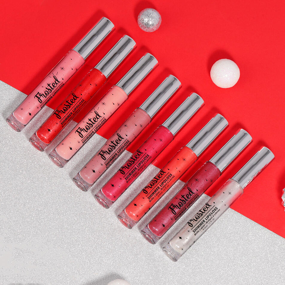
Ashley Lee Cosmetics Frosted Shimmer Lip Gloss Image
2022CLIENT: ASHLEY LEE COSMETICSUsed to post on social media accounts like Facebook and Instagram, this image is to promote the Ashley Lee Cosmetics Frosted Shimmer Lipgloss. The target audience is women within the 20s to 40s age bracket who want a glittery gloss look with a hint of tint on their lips. To make the audience interested in this product, all 8 lipgloss colors are presented and are placed side-by-side to show the differences in each bottle. This image is great to post during holidays such a Christmas and Valentines thanks to its limited color background palette of reds, whites, and silvers; alongside the glitter elements.

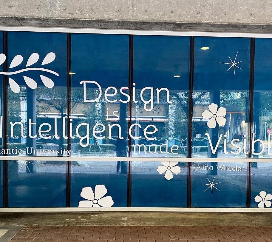
FAU METROLAB Windows
2021CLIENT: FLORIDA ATLANTIC UNIVERSITY'S FORT LAUDERDALE CAMPUSAn environmental design for campus windows on a highly trafficked downtown street installed for the winter holiday season and beyond. The objective was for the design to reflect the winter holiday season in South Florida. The traditional imagery of flowers, sparkles, balls, and branches are meant to tie in with the winter season without using any overt holiday imagery. The color palette being navy blue helped create a cool tone. The quote was chosen to convey that the FAU Fort Lauderdale campus is the creative campus — housing programs including Graphic Design, Architecture, and Multimedia.


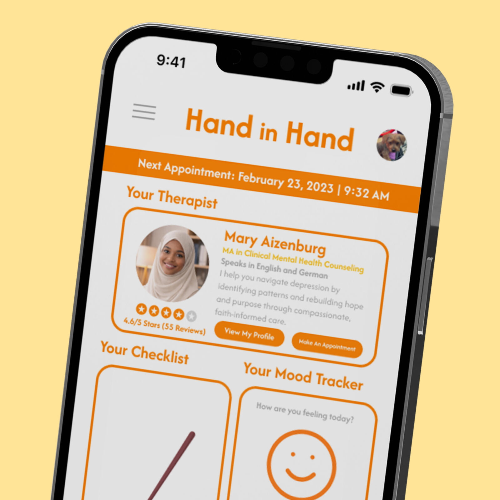
HAND IN HAND APP REDESIGN
2026CLIENT: FLORIDA ATLANTIC UNIVERSITY STUDENT PROJECTHand in Hand is a conceptual therapy app designed to make mental health services more accessible through an unlimited monthly subscription model. Originally created in 2021, the app relied on common healthcare visuals that felt dated, so the redesign focuses on simplification and differentiation by reducing the color palette and elevating orange as the primary brand color. Updated iconography, refreshed calendar and chat components, AI-generated profile pictures, and conversational microcopy supported by emojis help create a modern, cohesive, and approachable experience that emphasizes personalization and accessibility.


